


The Latest | Oct 30, 2021
Kansas City Current Reveals Name and Crest at Inaugural Season Finale
Powered by the rising momentum of an historic Inaugural Season, the Kansas City Current revealed its team name, crest and colors tonight at halftime of its final match of the year.
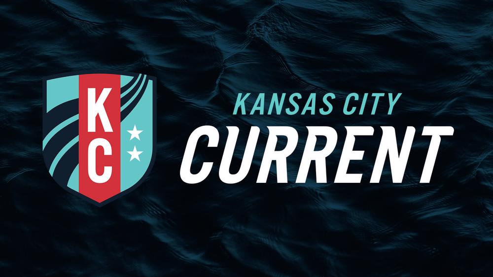
Following a light and laser show and brand reveal video, Kansas City players returned for the second half of the match in kits bearing the new crest, which features a river current, pushing beyond the boundaries of a traditional soccer crest shape and representative of the power and promise of the athletes. Similarly, the design taps into Kansas City pride with two stars representing Kansas and Missouri, and a familiar “KC” re-imagined in a vertical format. The vertical format communicates the upward momentum of the team and the support of the women and Kansas Citians who have built the foundation.
The crest and team colors are an evolution of the Inaugural Season colors with Teal and Heartland Red carrying over to the permanent crest. Teal, a fan favorite from day one, signifies optimism, hope and inclusion, and Heartland Red represents the team’s location in the heart of the country. Storm, an intense deep blue, is a grounding color symbolic of strength, determination and power.
“Every element is meticulously designed to tell the story of who we are, how we play and what we represent as a club,” said Co-Owner Brittany Matthews, who chaired the club’s Brand Advisory Council. “I can’t wait to celebrate the championships that will be won with our team wearing and representing this new brand.”
The new brand identity also includes a wordmark and proprietary, hand-drawn font that reflects the movement and power of the brand. The name simultaneously pays homage to Kansas City’s history and to the bold path the team has carved for the future, with plans for a $15-million training facility and $70-million stadium, both of which will be located on the Missouri River.
“From moment one, we knew the deep importance of our brand announcement and how critical it was for us to select a brand that our community could be proud of and rally around. Most notably, the time we spent researching and listening to our fans, our players and our community was the foundation for us to make this decision,” said Co-Founder and Owner Chris Long. “Across every stakeholder group, we heard words like ambitious, fierce, powerful, visionary and inclusive. Immediately, our entire team had this vision of an unstoppable force churning below the surface in the heartland. When we solidified the locations for our training facility and stadium on the Missouri River, we all knew the name had to be Kansas City Current.”
Kansas City Current was selected from hundreds of suggestions provided by stakeholders and fans through round tables, one-on-one discussions, Founding Member surveys and an in-stadium survey at the team’s first match.
The feedback indicated that the name and crest needed to be authentically grounded in classic Kansas City while representing the forward momentum of a city on the rise. It also needed to reflect the elite level of play, power and determination of the players.
For both the interim and the new brand identity, the team partnered with Willoughby Design, a Kansas City-based, woman-owned brand strategy, identity and communications firm.
Share
Stay up to Date

You are about to leave this site. Do you want to continue?